


museum case study
Product Design
2019
Museum application
you will love at first sight.
There is no excuses. Fast and easy manage and explore
your museum collections and exhibitions.
main problem
Working easier and faster with my
exhibition and calendar
Every kind of state museum would like to be more effective in their job. The Museum Dashboard is a solution for every kind of organisation.


challenges
3 tasks we needed to be done well
Regardless of every kind of task, the main rule we need to have in mind is a great user exeprience.

research & discover
We do research to improve the quality for our users.

ux stratedy from scratch
We create high level plan which improve value of the product.

increse user experience by workshops
We do not work for the customer only with. We create together in the workshops.

simplify user interface
Do not leave this blind fate and choose a reliable partner.

design process
5 days design sprint
A design sprint is a time-constrained, five-phase process that uses design thinking with the aim of reducing the risk when bringing a new product, service or a feature to the market.
- workshops

- problem definition

- ideation

- design & prototype

- user testing

- implementation

The entire process of going from a problem or business need through a concept and finally to release and gathering user’s feedback.
effects
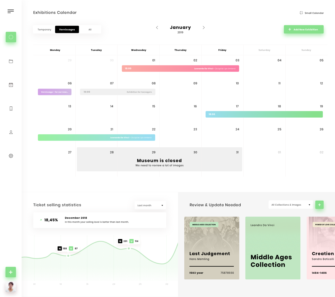
Increased conversion, faster navigation
We was trying to build something usefull with fast one level navigation. Final effect prove that was a big effort but it is well done.

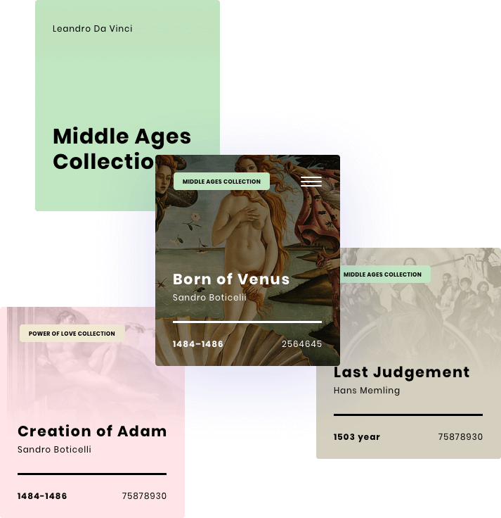
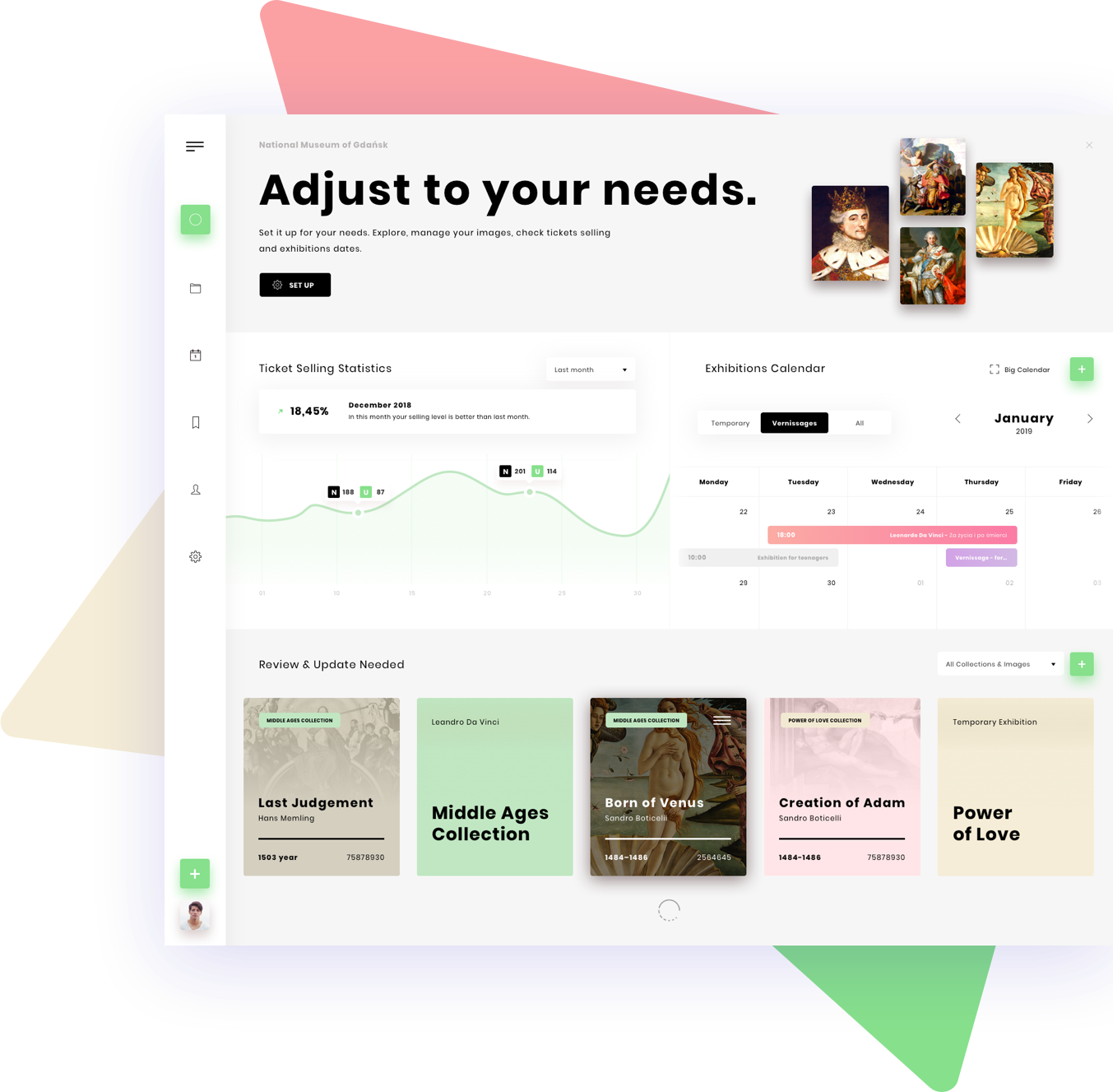
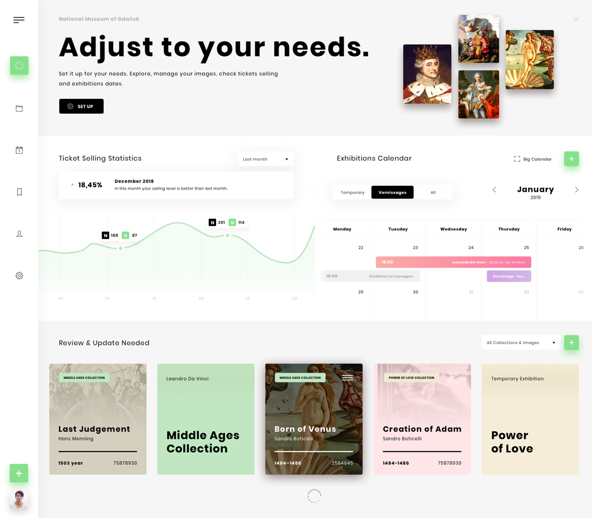
Usefull Collections Cards
First, we would like to introduce collections cards. It is very usefull solution to manage and explore your images in your organisation. Very clear details about collections, images is very simple to recognize the collection or image you want to manage.
Just it.
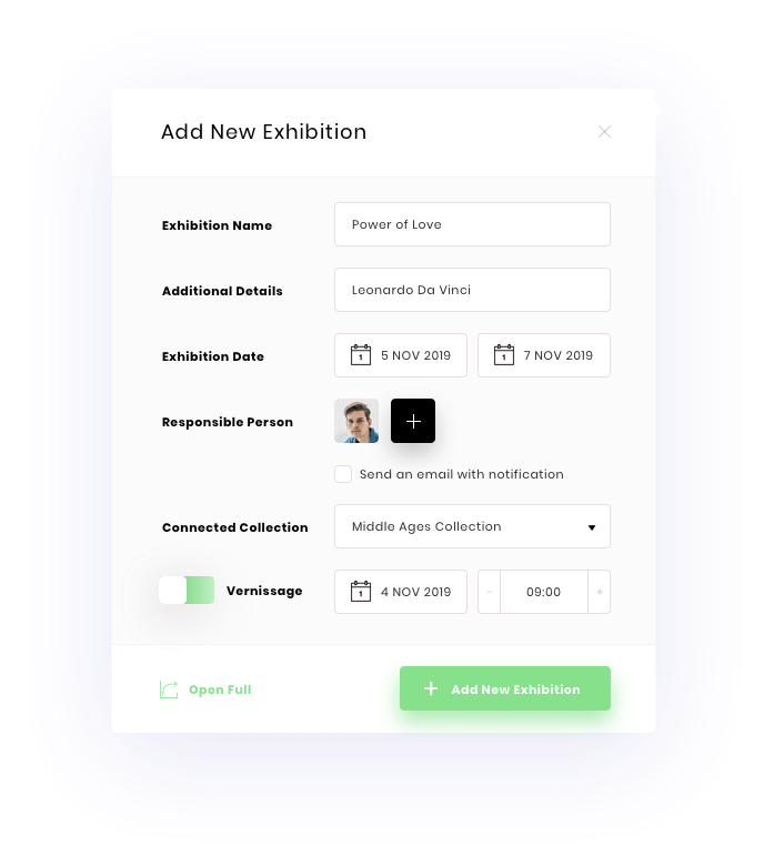
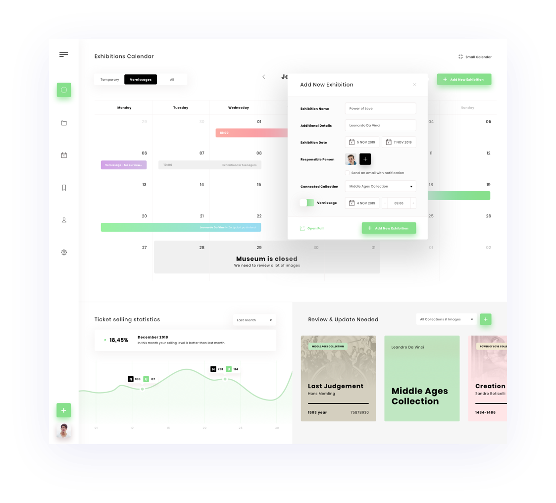
Fast Exhibition Adding
A lot of employees would like to add some new exhibition fast. We have a solution for this feature - you can click „plus” button and that is. No new pages, it’s a context form you can see after click immediately.
Simple, fast, easy solution for one of core feature in the app. Awesome.
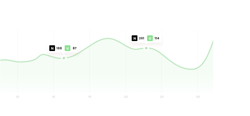
Economic features
Line graph and statistics of selling level is one of the main feature. You can see how many tickets you are selling this month, how many tickets you sold last month and what tickets.
Very useful to see which exhibitions are best seller and which you need to stop and never do it again.
85
people tested1823
working hours207
screens designed
We translate your business goals and objectives into insightful UX, remarkable UI and distinctive visual concepts.

Projects you may also like
Check out our another projects to be sure our effects
and approach is correct.